
Inside Look: Email Excellence Awards Winners And Why They Won
What makes a good email, great? A good email may get subscribers to click. But a great email creates a memorable subscriber experience—even after they close out of their inbox.
In September, we put out a call for your most prize-worthy campaigns as part of Litmus’ Email Excellence Awards—and there was no shortage of great emails. After two rounds of voting for the Litmus Choice categories, and internal and external judging rounds for the remaining categories, the winners were selected.
So what makes a winning email? Read on to learn what we looked for and why.
Best Email Design categories
Designing emails takes incredible talent. With the thousands of ways an email can render, accessibility requirements, and changing trends, an email designer has to tap into a vast skill set for success in the inbox.
The Best Email Design winners (Lev for B2C and Ally Financial for B2B) were selected after two rounds of voting. The first round was made up of a panel of Litmus judges; the second round sought votes from the Litmus email community.
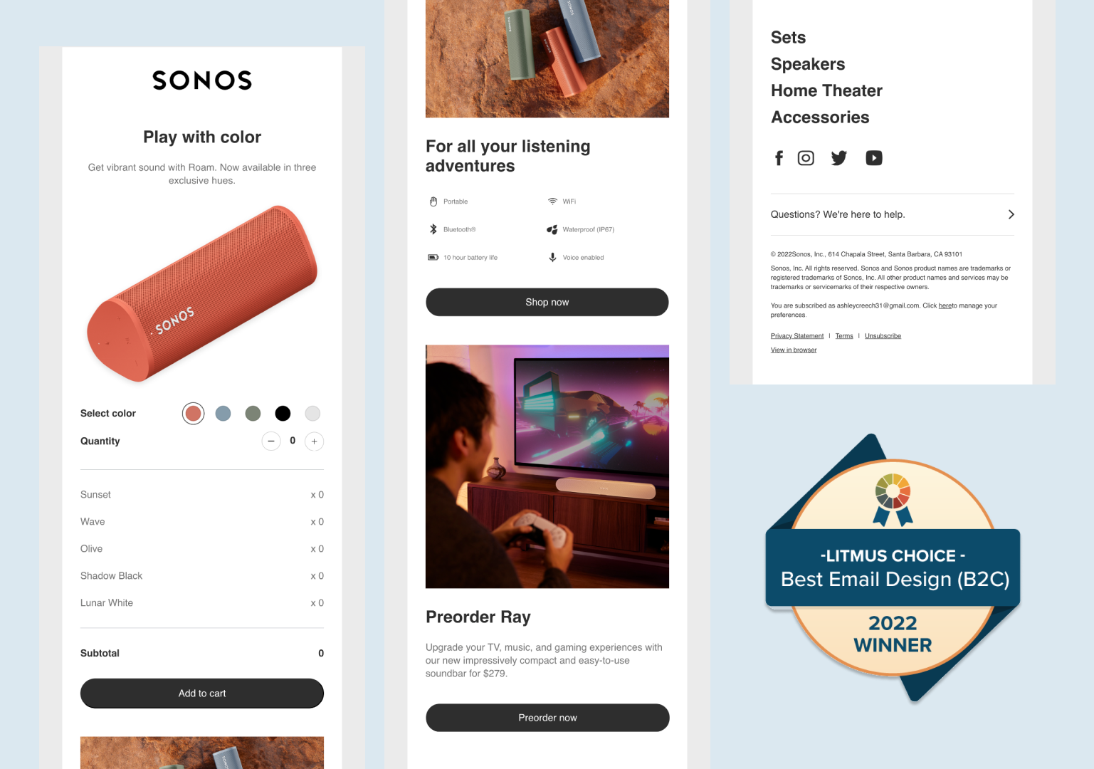
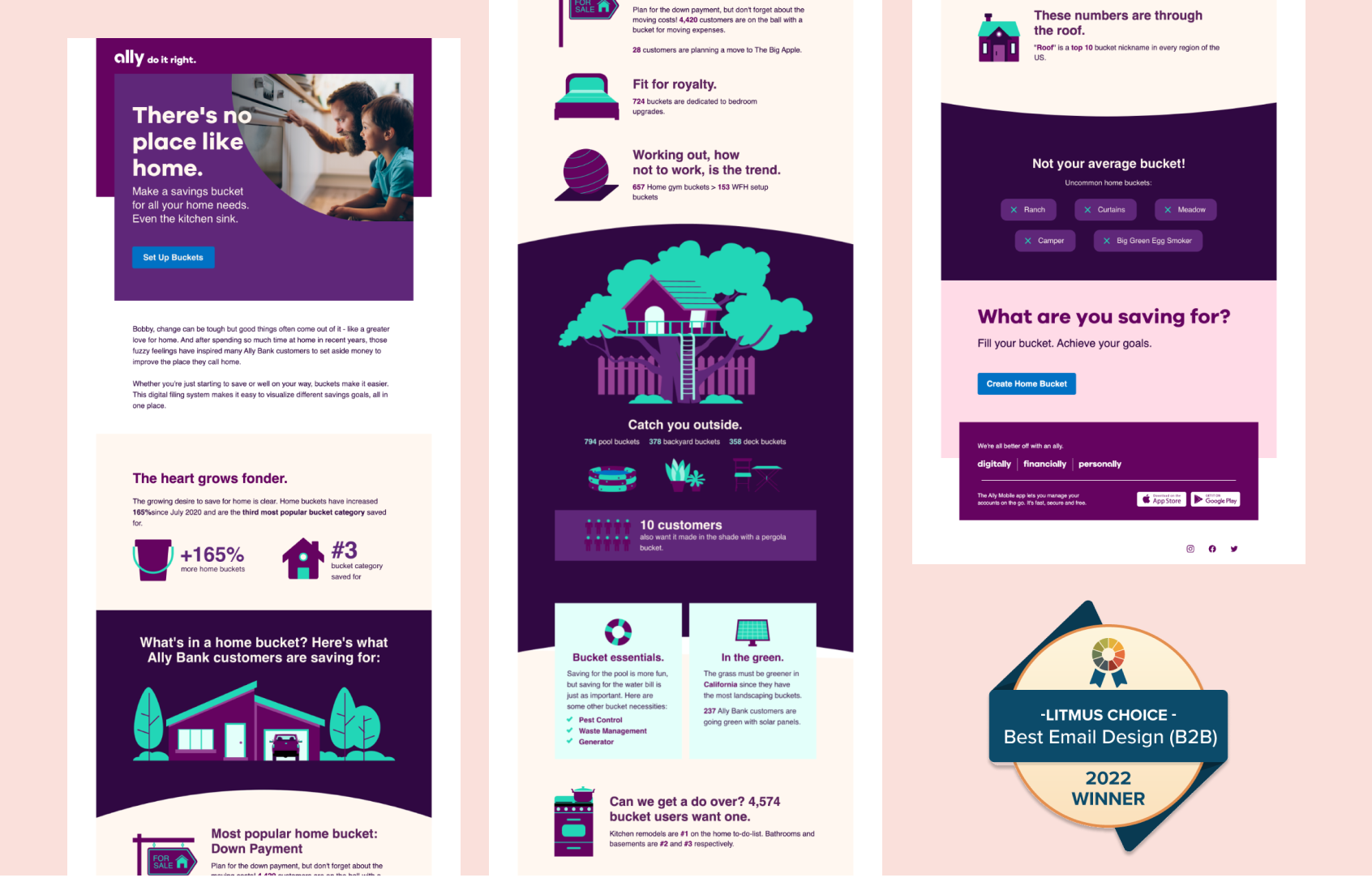
Lev and Ally Financial hit all their marks with designs demonstrating innovation and a great subscriber experience. But what specifically about these designs help them move into the final, winning round?
What makes a good email design, great?
At Litmus, we consider the following to be core components of great email design:
The winners delivered on every one of these elements, making them the choice email designs among our judges and the community.
Most Innovative Personalization categories
There’s no denying the power of personalization. According to Campaign Monitor, it’s proven to “drive revenue by as much as 760% because it helps marketers give subscribers more relevant, individualized content.”
Since email personalization is now a top priority for marketers, we introduced this new award category to highlight campaigns that took a fresh and original approach to personalization and displayed a great understanding of the customer.
What does award-winning innovative personalization require?
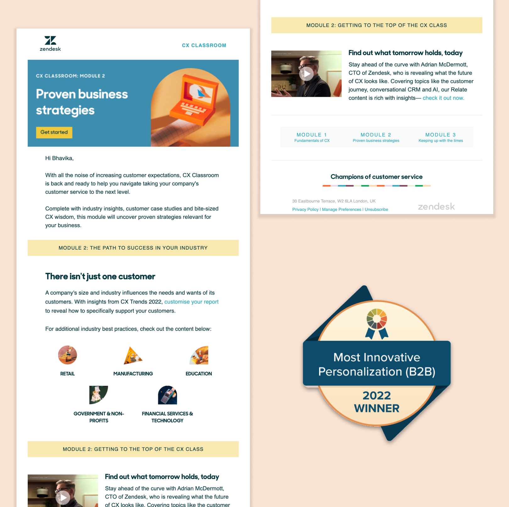
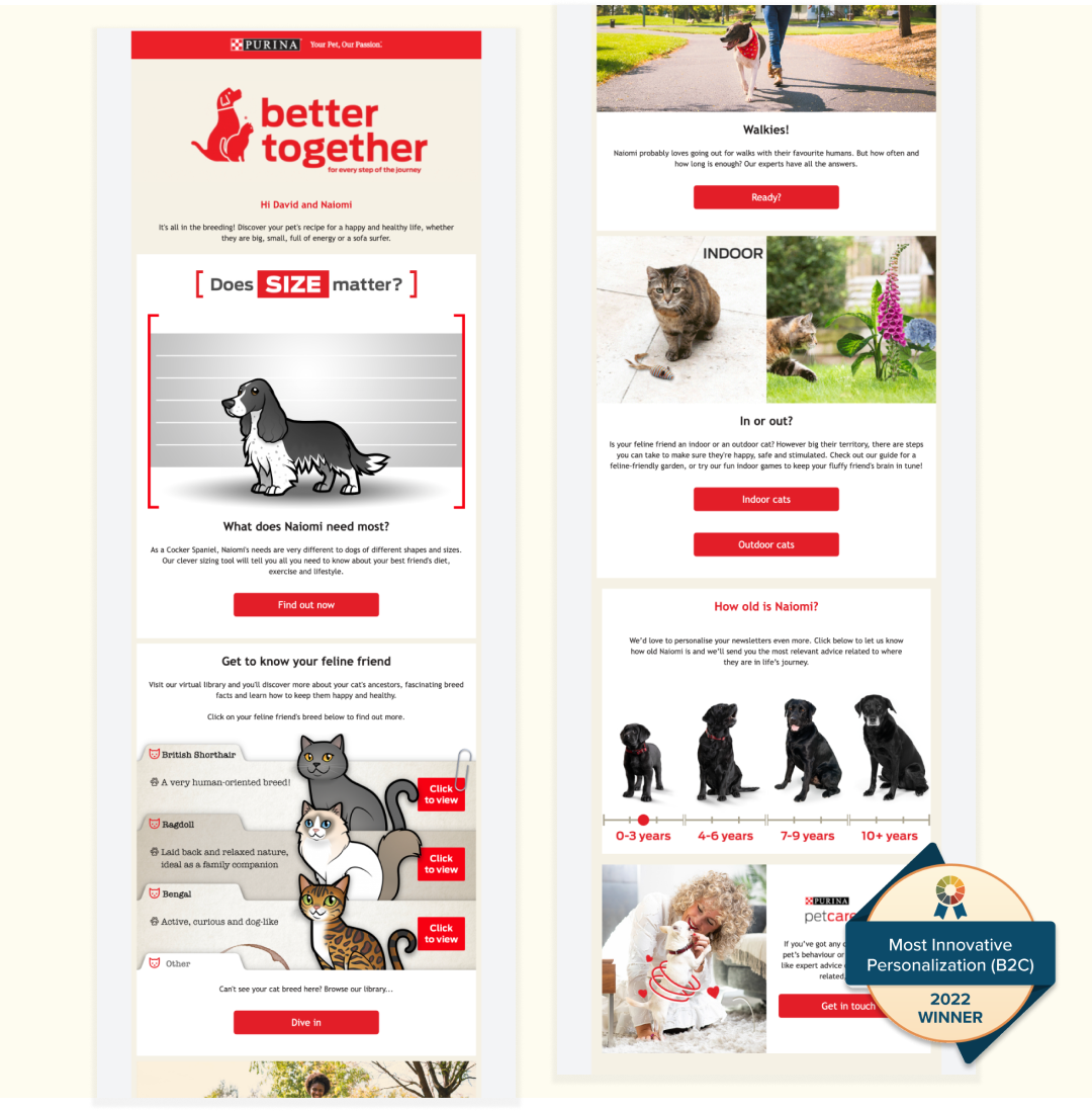
Zendesk and HH Global (for client Purina) took home the prize for Most Innovative Personalization. The level of thought and detail that went into each campaign was truly applause-worthy. But what made Zendesk and HH Global stand out from the crowd? Here’s what we looked for:
- How personalization or dynamic content was used
- Which elements were personalized—and why
- How personalization was used to connect with subscribers on a unique level
- How personalization helped achieve their goals
Best Onboarding Email Series category
First impressions matter—and are powerful. Compared to a standard email campaign, onboarding (or welcome) emails get four times the open rate and five times the click-through rate (CTR) according to WordStream—illustrating just how valuable subscribers find these programs.
Your onboarding (or welcome) emails set the tone for what subscribers can expect from your business. They are a critical part of the welcoming committee as your customers ramp up with your product or service. These touch points define the next steps of the journey: they ensure short-term satisfaction as customers onboard, and long-term success and loyalty as they become a part of your community.
What makes a great onboarding series?
This award went to the best onboarding series that made a great first impression and helped customers find value—fast. We looked for an onboarding series that:
- Clearly emphasized how customers can get started and find value fast
- Included clear CTAs and actionable next steps for customers
- Highlighted the value proposition and overall benefit of their brand/business
- Shared appreciation for new customers
- Implemented regular testing, learning, and iterating
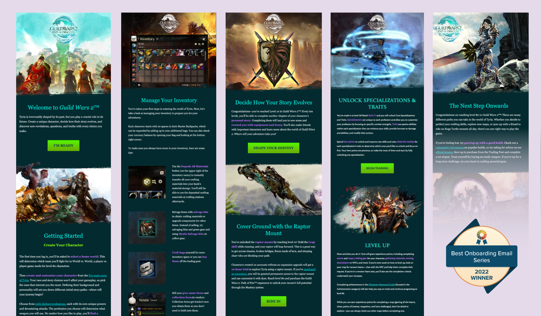
NCSOFT‘s onboarding series did just that. Over a series of five emails, NCSOFT (video game publisher and developer) guided players on what to do at different player level trigger points. This series resulted in increased logins by 46% and incremental sales by 48% in the first half of the year.
Best Data-Informed Email Transformation category
As of August 2022, 12.1 billion emails were opened in 2022, with an average of 1.5 billion emails opened each month. With such a large volume of emails being opened, how can email marketers make more informed designs, ensure the best send times, and deliver personalization that breaks through the noise? It all boils down to data—and how you use it.
Data empowers email marketers to deliver a more sophisticated, personalized experience. By leaning on metrics to measure what worked (and didn’t), you can continually refine your strategy to improve your email program’s performance.
This category recognized emails that transformed over time to drive better results by applying testing, data, and learnings. We looked for email marketing campaigns that dove into the details, refined their approach, and executed an email transformation with measurable success.
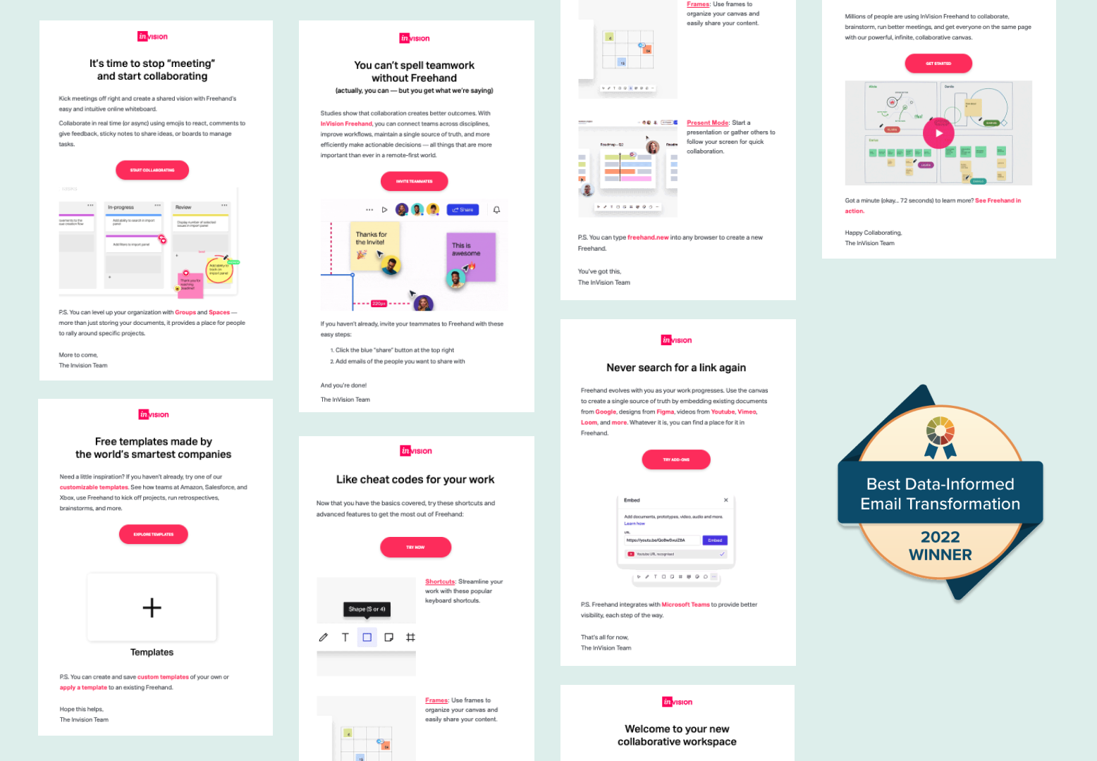
The winning email came from InVision. What about this email worked—and made it a winning email? We looked at a few things:
- Metrics measured to improve your email performance—and how they were determined
- The data-informed iterations made over time
- Results from iterations
- Learnings from the campaign to carry forward
Congratulations to our winners!
There were so many great submissions (100+!) that came in, making it hard to narrow down from round to round. We were blown away and thank everyone who participated—including the voters on Litmus Weekly who helped us pick the winners of the Best Email Design categories.
We look forward to seeing what emails you submit next year.
